NED FARRELL : : PORTFOLIO
DIGITAL DESIGN • UI DESIGN • WEB/EMAIL DESIGN • GRAPHIC DESIGN • VIDEO • MULTIMEDIA DESIGN


Aeropostale is a clothing brand with a retail presence and a focus on the tween, teen and college demographic market. My work for Aeropostale included gift card design, billboard layouts, t-shirt design, in-store signage and props as well as web work for their site. A large part of the work I did for Aeropostale was for the grand opening of their flagship store in Times Square NYC. Worked on both Aéropostale and also for their kids line called: P.S.O9.
I did also work in their web dept, mostly in a production capacity.
I did also work in their web dept, mostly in a production capacity.
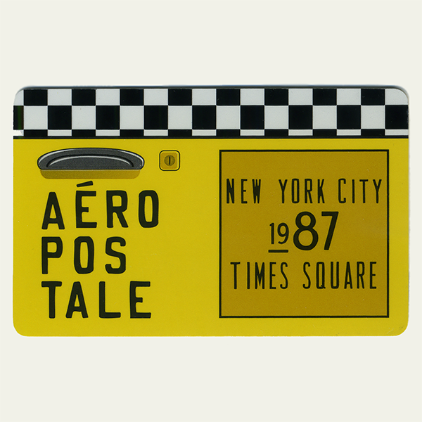
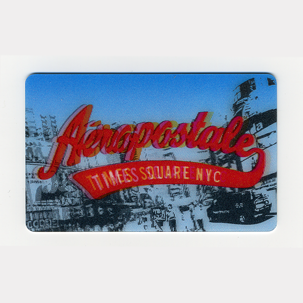
Gift Cards + T-Shirts + Billboard
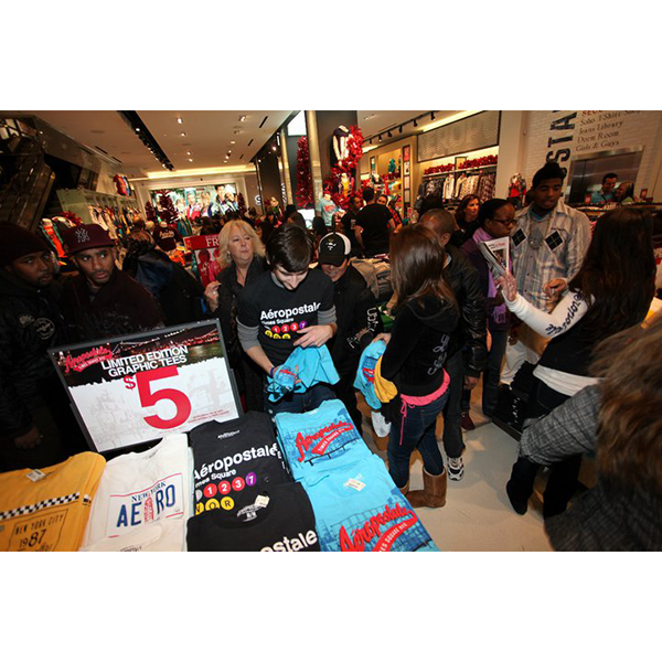
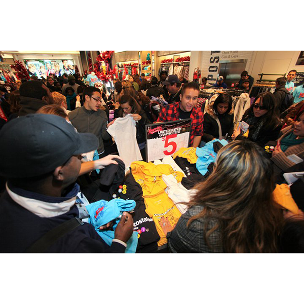
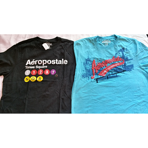
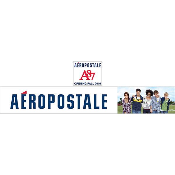
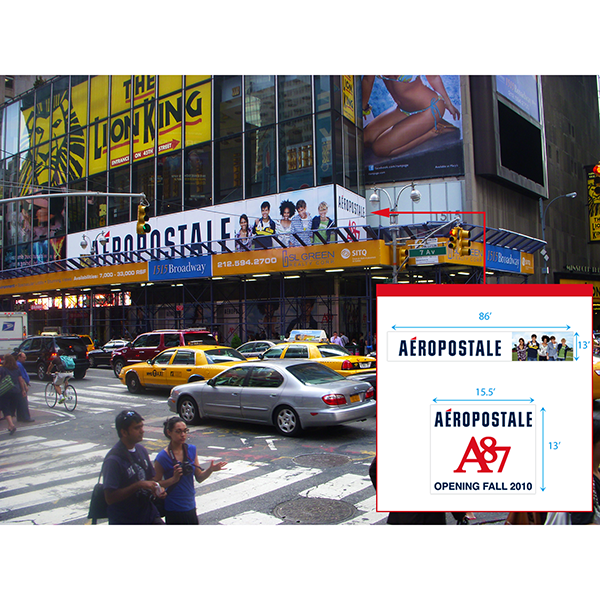
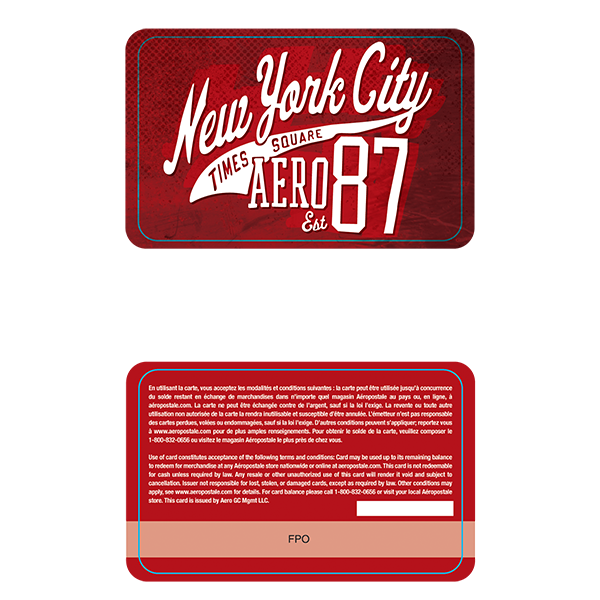
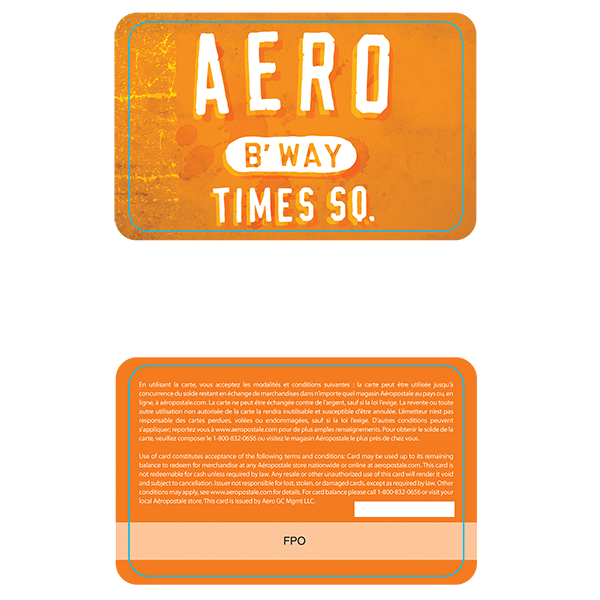
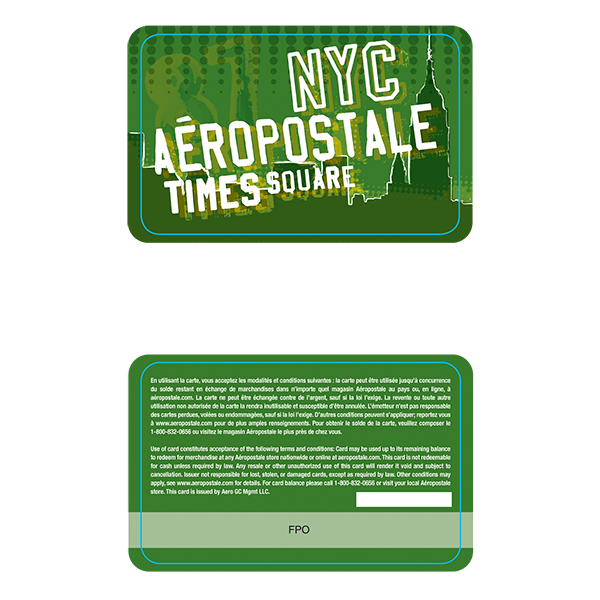
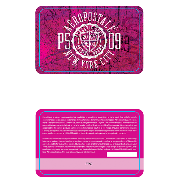
These gift cards and t-shirts were created to be featured in Aéropostale's granding opening of their flagship store in Times Square. It was NYC focused and I created distinctly unique NYC motifs and landmarks and incorporated them into Aeropostale's style and branding for their opening. The T-shirts all blew out in a week, the art director was kind enough to grab 2 for me(pictured) and I was informed that these gift cards were the most stolen item. The billboard was for placement while the store was being worked on.
These gift cards and t-shirts were created to be featured in Aéropostale's granding opening of their flagship store in Times Square. It was NYC focused and I created distinctly unique NYC motifs and landmarks and incorporated them into Aeropostale's style and branding for their opening. The T-shirts all blew out in a week, the art director was kind enough to grab 2 for me(pictured) and I was informed that these gift cards were the most stolen item. The billboard was for placement while the store was being worked on.
Gift Cards
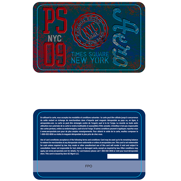
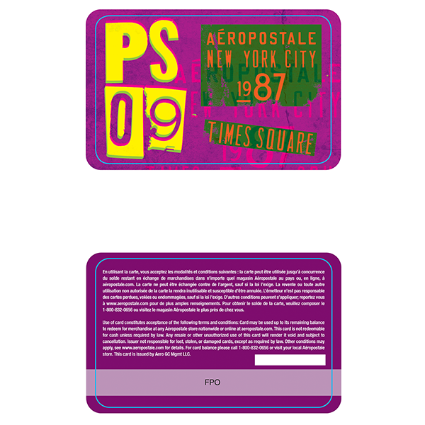
These were also gift cards designs created for the Times Square store; there were many of these. Created for Aeropostale as well as for their kid's brand: P.S.09.
These were also gift cards designs created for the Times Square store; there were many of these. Created for Aeropostale as well as for their kid's brand: P.S.09.
Signage + Visuals
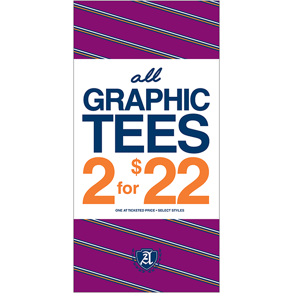
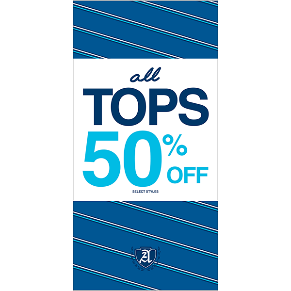
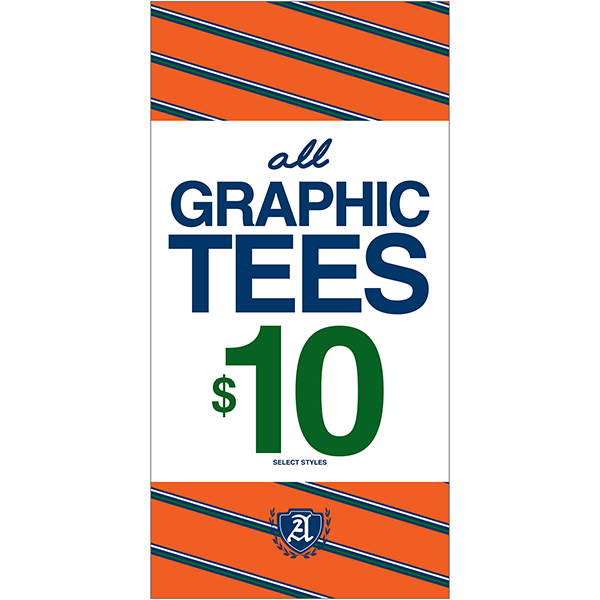
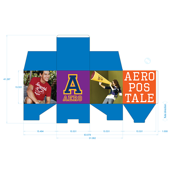
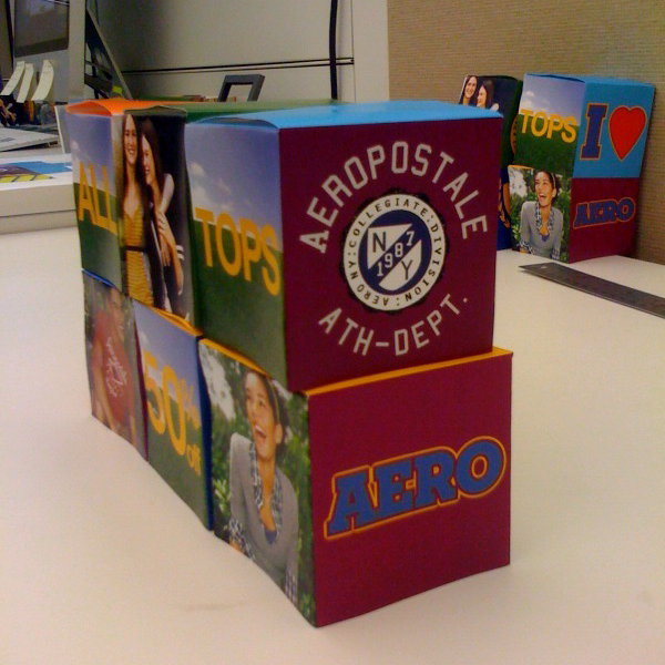
There are a lot of these as well, just showing these examples for understanding. The first were just standard fixture-sized posters. The work here included design, pattern-making, sizing and layout. The cubes were designed to have various Aéropostale aesthetics and images, and be able to be turned to give different messages and have a 3D element for in-store use.
There are a lot of these as well, just showing these examples for understanding. The first were just standard fixture-sized posters. The work here included design, pattern-making, sizing and layout. The cubes were designed to have various Aéropostale aesthetics and images, and be able to be turned to give different messages and have a 3D element for in-store use.

