NED FARRELL : : PORTFOLIO
DIGITAL DESIGN • UI DESIGN • WEB/EMAIL DESIGN • GRAPHIC DESIGN • VIDEO • MULTIMEDIA DESIGN


Mirrorball is a NYC-based marketing and experience design agency, with a concentration in the beverage industry of both the alcohol and non-alcoholic variety for its varying clients. My work with Mirrorball has involved visual design for tradeshow booth skins, experiential design, event stagings and promotions they were putting on as well as large-scale print work for major music festivals like "Riotfest." Work has also included web/UI design for promotional microsites, and book design, layout and production.
Mirrorball is big on creating experiences for their clients and their consumers, and throws a helluva party. Some of their clients I worked on were Perrier, Jack Daniel's, Dos Equis, and Heineken.
Mirrorball is big on creating experiences for their clients and their consumers, and throws a helluva party. Some of their clients I worked on were Perrier, Jack Daniel's, Dos Equis, and Heineken.
Jack Daniel's Microsite
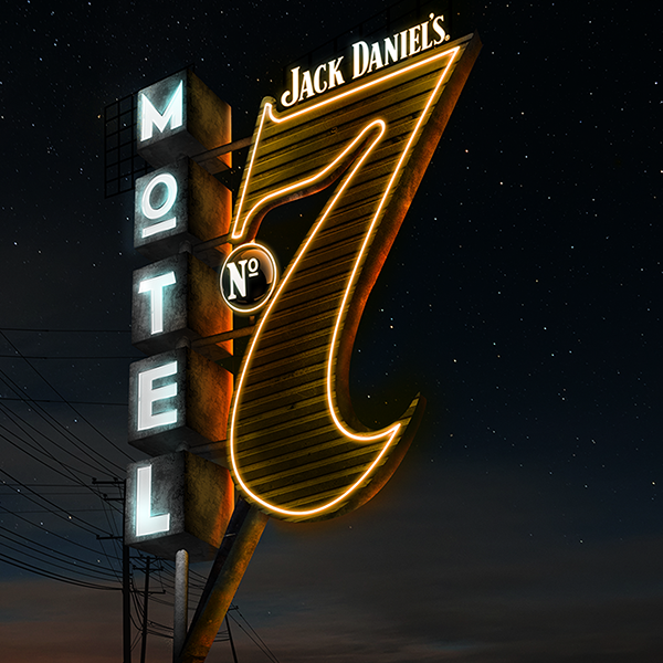
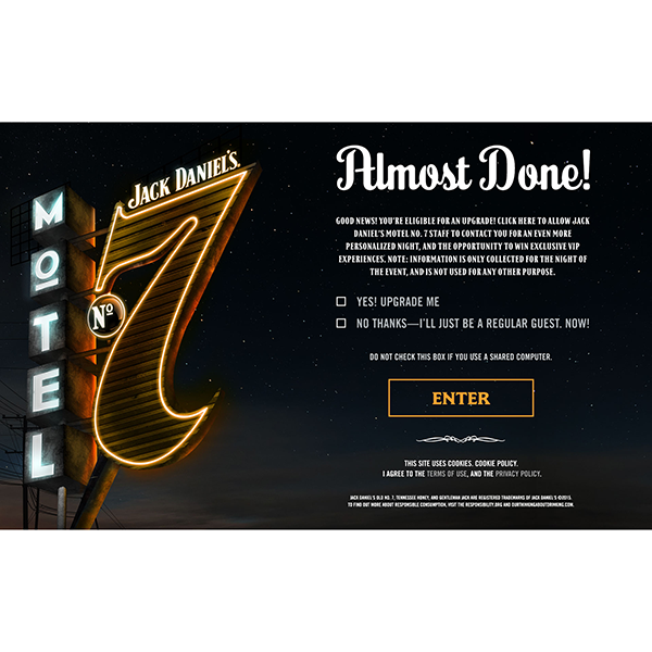
These were created for Jack Daniel's microsite. The photo composite was used in many forms for their campaigns going forward. These were for the opening page of Jack Daniel's microsite.
These were created for Jack Daniel's microsite. The photo composite was used in many forms for their campaigns going forward. These were for the opening page of Jack Daniel's microsite.
Riotfest Signage
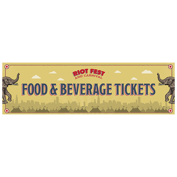
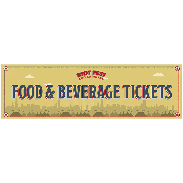
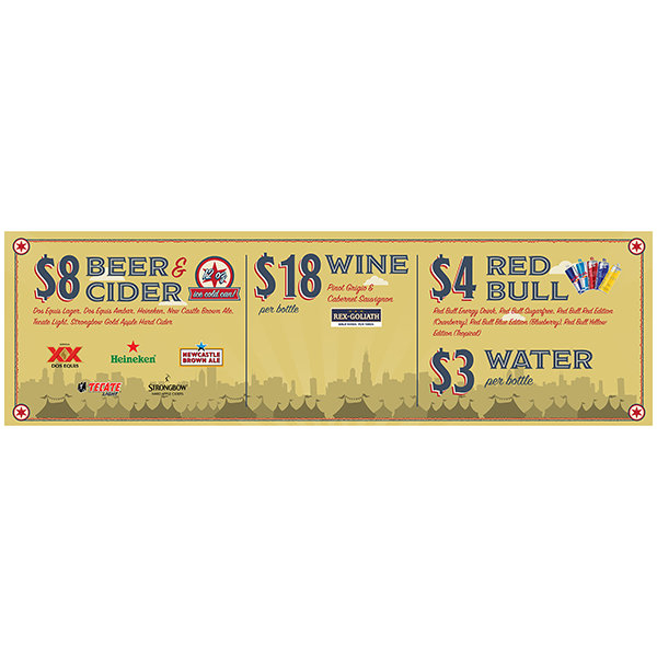
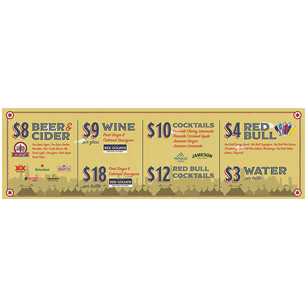
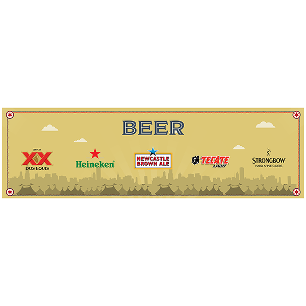
These were large printed banners (3 feet x 10 feet) for the Riotfest musical festival in cahoots with the festival's organizers and sponsors. Designed based on Riotfest's carnival-like motif and meant to be large and hung high above the crowds so people could locate certain vendors with ease. There were a few of these, I'm just showing these to give the idea some of the work done for this massive music festival.
These were large printed banners (3 feet x 10 feet) for the Riotfest musical festival in cahoots with the festival's organizers and sponsors. Designed based on Riotfest's carnival-like motif and meant to be large and hung high above the crowds so people could locate certain vendors with ease. There were a few of these, I'm just showing these to give the idea some of the work done for this massive music festival.
Signs + Skins
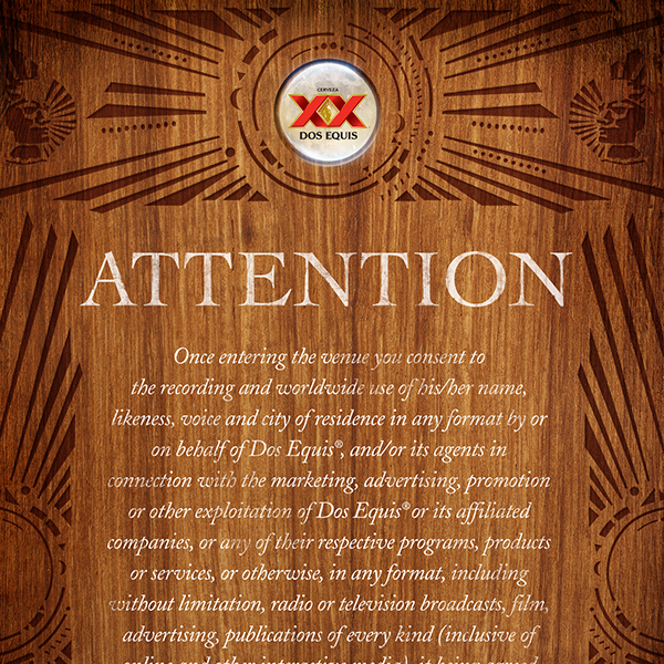
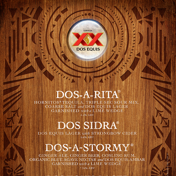
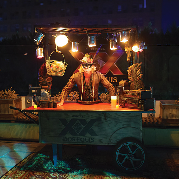
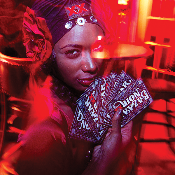
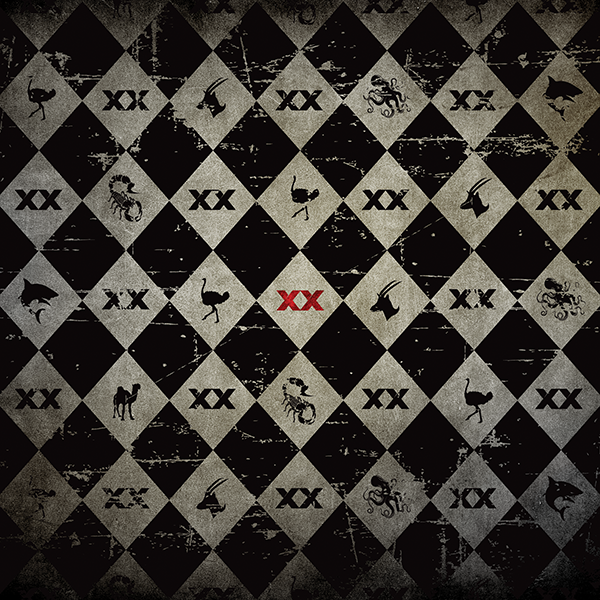
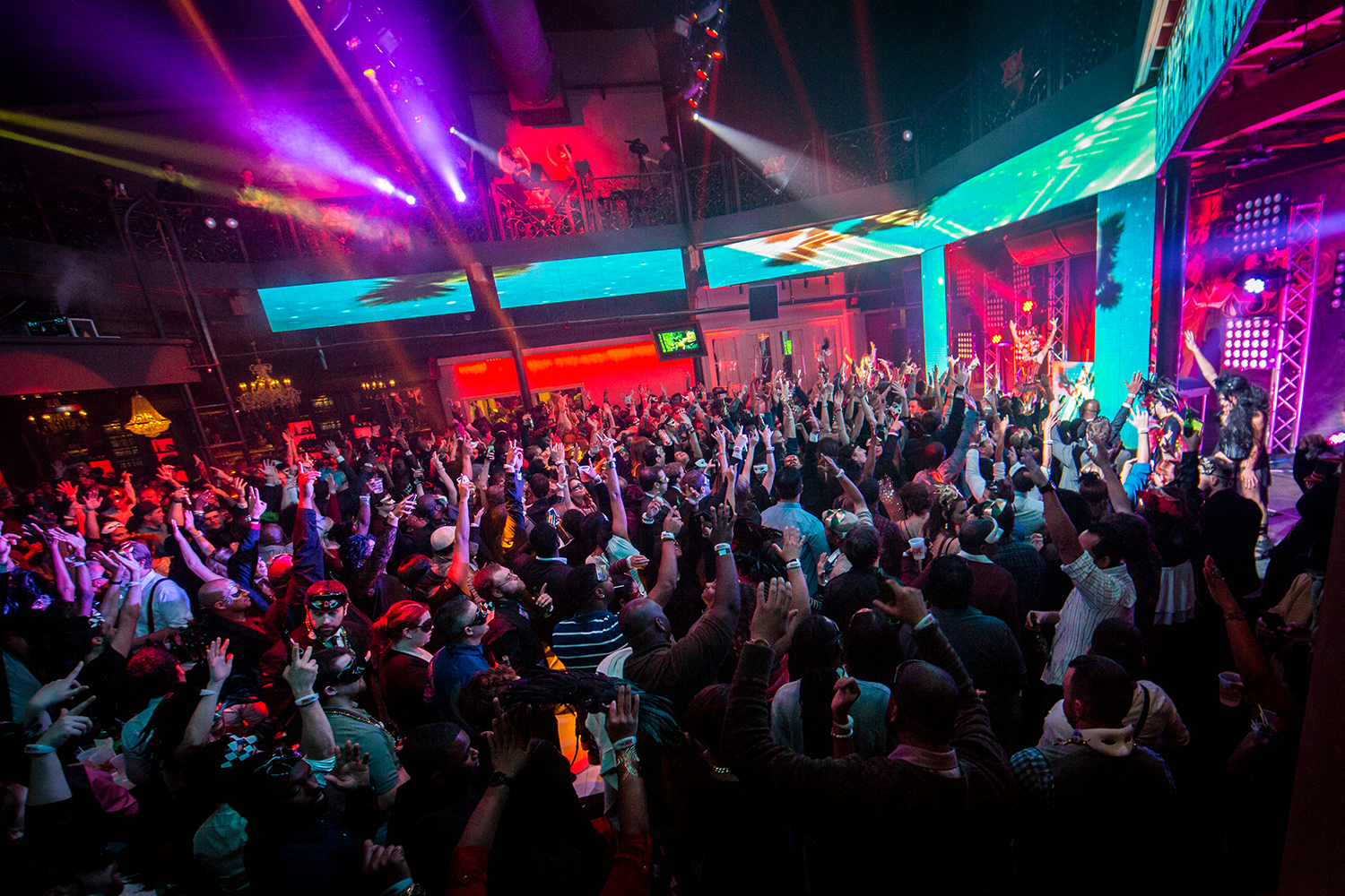
There are a lot of these designed and produced for Mirrorball's many clients. I'm showing some of the signs and experiential design/skinning of props and walls that were done for a Dos Equis promotional/party event called: Masquerade. The images at the end are from the actual event and shown so one can understand some of the uses of these signs and the direction they were going in for this particular themed party. There was a lot of schwag and collateral designed and produced for each of these respective events/parties.
There are a lot of these designed and produced for Mirrorball's many clients. I'm showing some of the signs and experiential design/skinning of props and walls that were done for a Dos Equis promotional/party event called: Masquerade. The images at the end are from the actual event and shown so one can understand some of the uses of these signs and the direction they were going in for this particular themed party. There was a lot of schwag and collateral designed and produced for each of these respective events/parties.
Books + Printed Material
These books were end-of-year publications to illustrate what had been acheived in way of events and promotional galas and festivals in the year of the Dos Equis work. If you click on the links you can get a glimpse inside. These were large publication, one was over 100 pages, so I have reduced the sizes and deleted a lot of pages to curb the file size, but it gives a good idea of what it was all about.
These books were end-of-year publications to illustrate what had been acheived in way of events and promotional galas and festivals in the year of the Dos Equis work. If you click on the links you can get a glimpse inside. These were large publication, one was over 100 pages, so I have reduced the sizes and deleted a lot of pages to curb the file size, but it gives a good idea of what it was all about.
Photo Composites
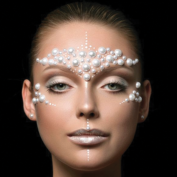
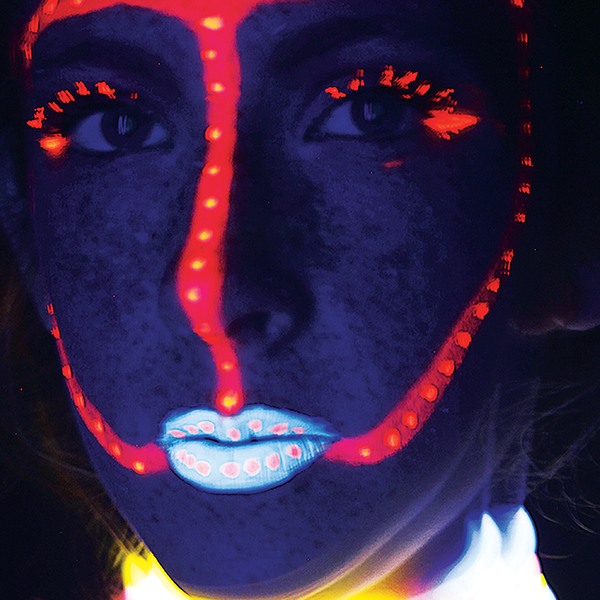
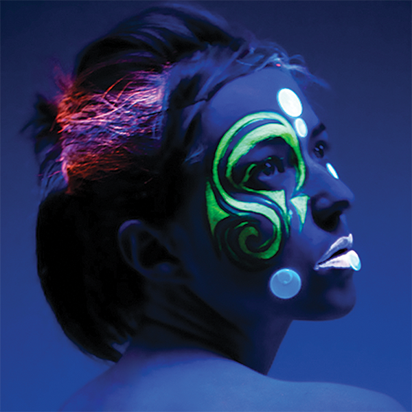
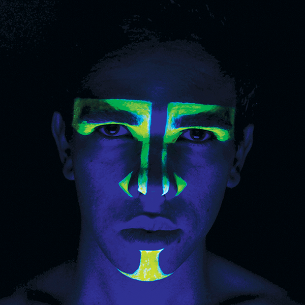
These were composited and created for use at an event and meant to coincide with the type of lighting that would be used as well as to match the theme of the event. Images were color enhanced and corrected and set to correct size for fixtures at the event. This was also a common thing to do as part of my work with Mirrorball.
These were composited and created for use at an event and meant to coincide with the type of lighting that would be used as well as to match the theme of the event. Images were color enhanced and corrected and set to correct size for fixtures at the event. This was also a common thing to do as part of my work with Mirrorball.
