NED FARRELL : : PORTFOLIO
DIGITAL DESIGN • UI DESIGN • WEB/EMAIL DESIGN • GRAPHIC DESIGN • VIDEO • MULTIMEDIA DESIGN


My work with Shiseido was in a purely graphic design role for the visual merchandising department. All work for this cosmetics company was print based and much was to be used in stores. The product placement I was a part of was for the brand's footprint in the stores Sephora and Nordstrom's. Work entailed photo compostions, layout for store signage, signs for light boxes, illustrations and renderings of their products for clear and consistent visual directives. Also a large undertaking was the skinning of store fixtures, which can vary between stores, and had to be accurate to the fraction of an inch for display purposes and so their products would align consistently and absolutely to their descriptions and price points in all Nordstrom's and Sephora stores.
Store Displays
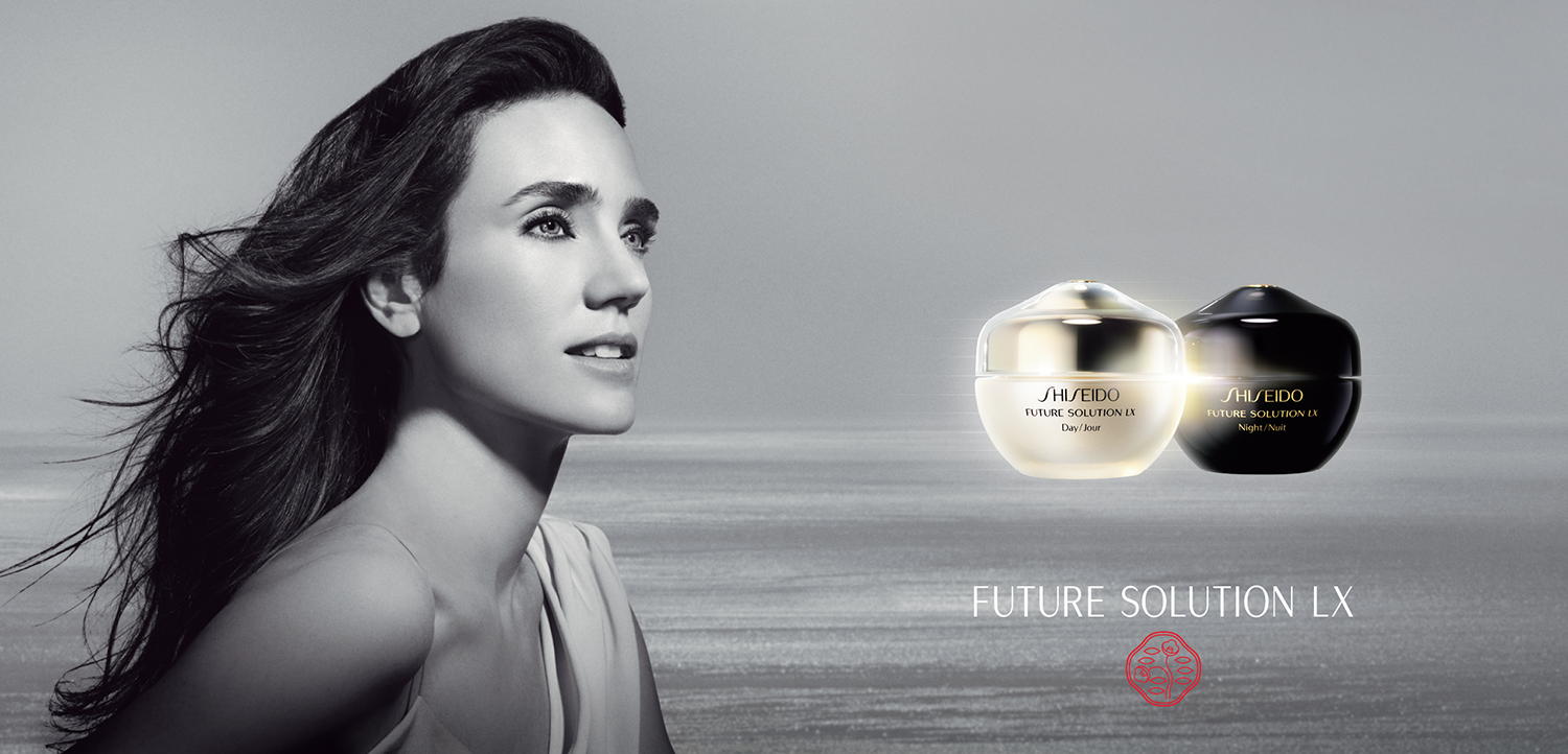
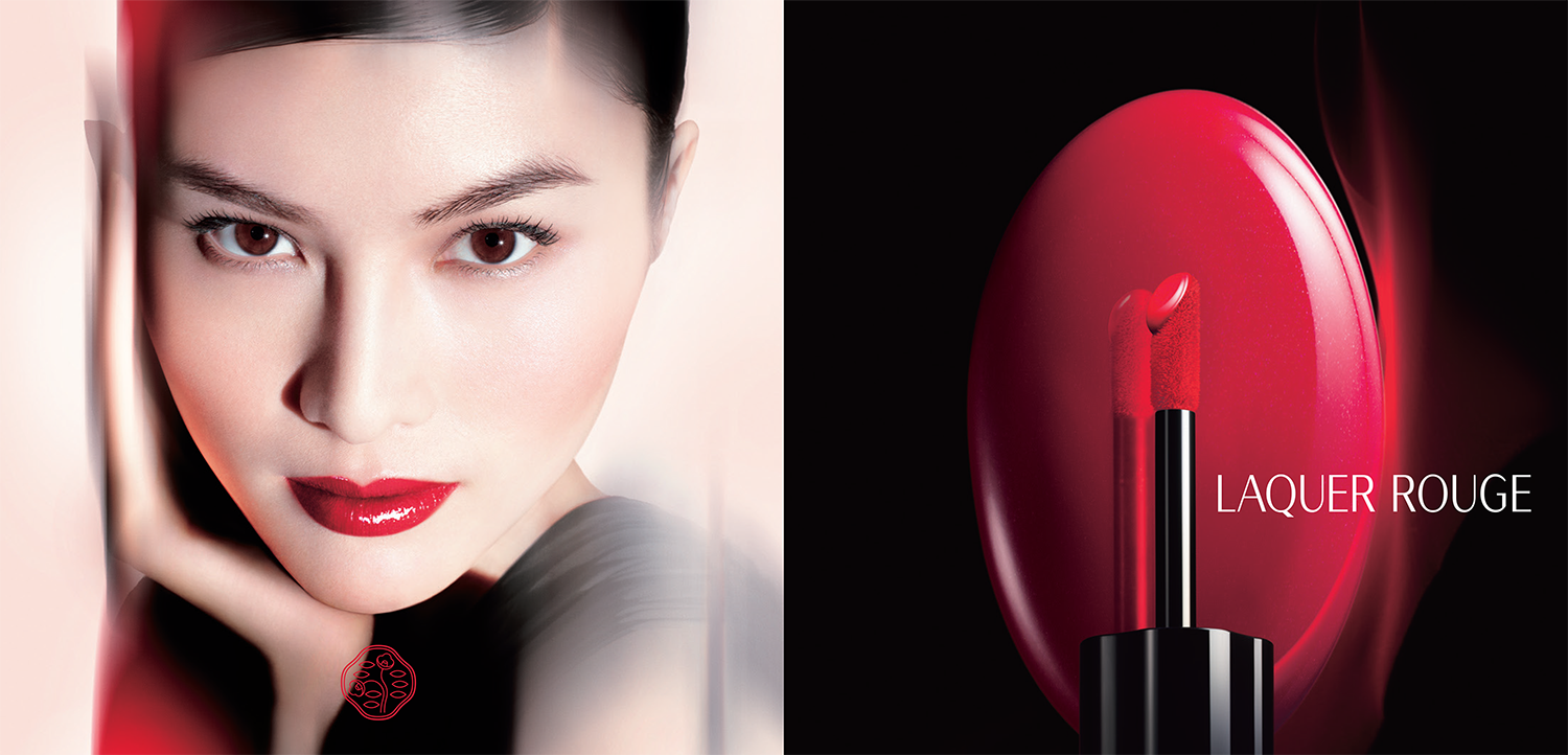
These bottom four examples were for fixtures and light boxes in Nordstrom's and Sephora. Work included photo composites, product placement, seamless product clipping and enhancing, color correction and properly sized layouts for varying fixtures. These were used with Shiseido product displayed beneath. Would be used at Shiseido cosmetics counters and stands at respective stores.
These bottom four examples were for fixtures and light boxes in Nordstrom's and Sephora. Work included photo composites, product placement, seamless product clipping and enhancing, color correction and properly sized layouts for varying fixtures. These were used with Shiseido product displayed beneath. Would be used at Shiseido cosmetics counters and stands at respective stores.
Display Signs
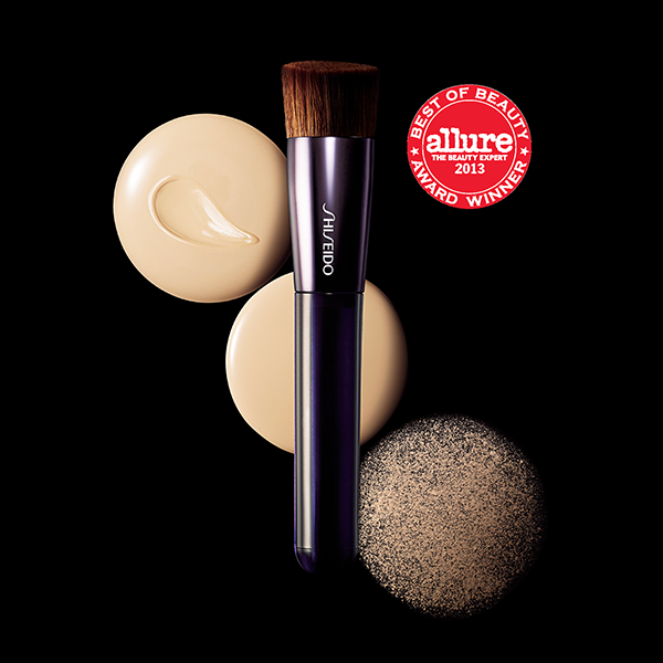
This is a small group of signs created for Shiseido's in-store displays. I'm just showing a varying few to give the idea of that type of work done for Shiseido, there are quite a few like this. Work involved image compositing, color correction, and proper layouts and sizings.
This is a small group of signs created for Shiseido's in-store displays. I'm just showing a varying few to give the idea of that type of work done for Shiseido, there are quite a few like this. Work involved image compositing, color correction, and proper layouts and sizings.
Illustrations + Renderings
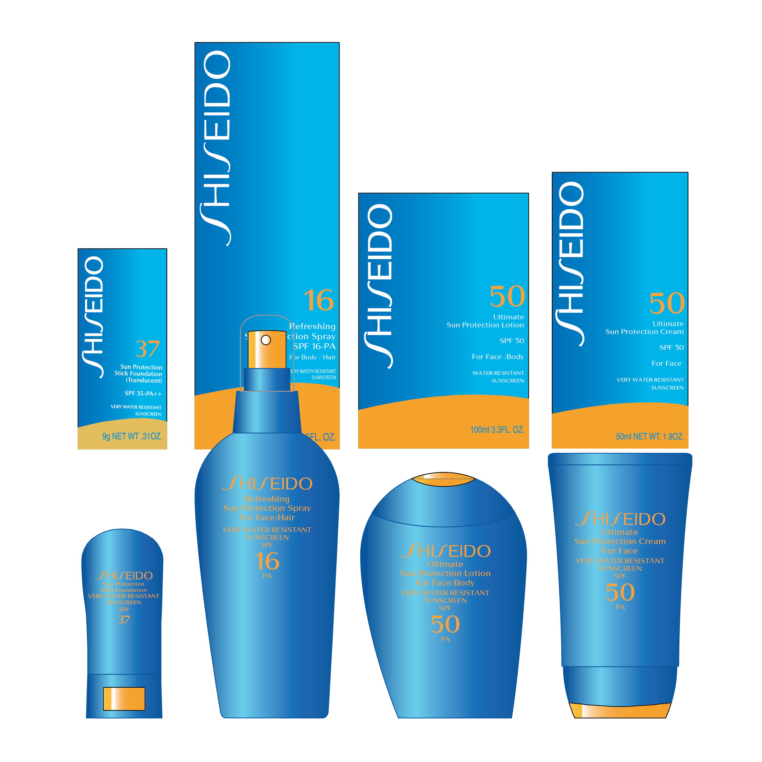
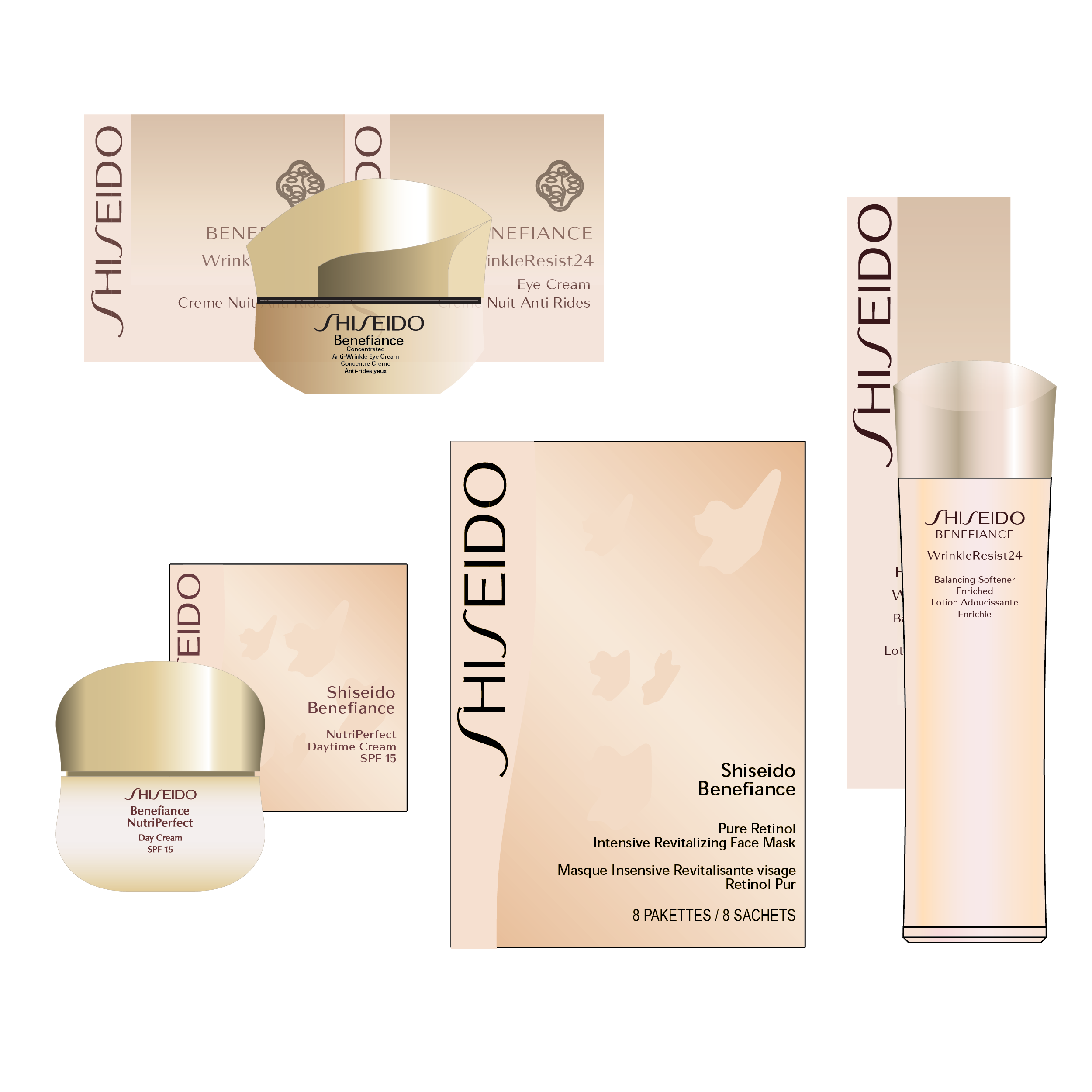
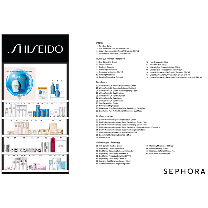
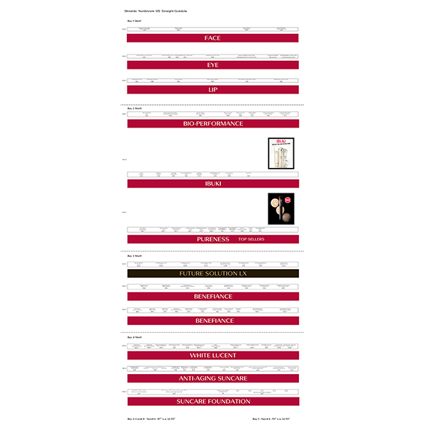
A key component of visual merchandising, and really the main objective, is clarity and consistency in dislay so all stores are homogenously represented and branded properly. Illustrating and placing these products in their rightful place is a core need for that consistency, so all Nordstrom's and Sephora stores are displaying them equally and to their store's particular fixturs; sizing. Below are just a few products I've rendered for such use. Next to that is placement illustrated in proper order for Sephora displays. Next to that are the strips ID'ing the respective products and giving the proper price tag that line underneath each product. It is imperative that all these categories align correctly with the product that will exist above them. There are a lot of these, just showing one for clarity and understanding.
A key component of visual merchandising, and really the main objective, is clarity and consistency in dislay so all stores are homogenously represented and branded properly. Illustrating and placing these products in their rightful place is a core need for that consistency, so all Nordstrom's and Sephora stores are displaying them equally and to their store's particular fixturs; sizing. Below are just a few products I've rendered for such use. Next to that is placement illustrated in proper order for Sephora displays. Next to that are the strips ID'ing the respective products and giving the proper price tag that line underneath each product. It is imperative that all these categories align correctly with the product that will exist above them. There are a lot of these, just showing one for clarity and understanding.
